Transition the MyAT&T mobile app from a hybrid app to a native app while adding new interaction capabilities and wearable device support
In response to user feedback regarding the hard-to-use nature of the MyAT&T mobile app, our AT&T Business partners have tasked the Native App Team with exploring the implementation of native iOS/Android tabbed navigation for the 1703 release.
The primary objective of this initiative was to enhance first iOS and then Android user satisfaction by offering a more immersive and native experience.
Additionally, we wanted to improve overall app navigation - with the potential for increasing app ratings, and introduce new features and support for unified UX across multiple screens and form factors.
We began by carefully considering the size and composition of our UX team, starting with a core group and adding members as needed based on functionality and feature requests. This approach enabled us to maintain a small and agile team while ensuring that all additional requirements could be supported with the same level of quality and attention as larger-scale projects.
Next, we examined our competitors and asked critical questions about their app designs. We sought to understand what worked well for them, what didn't, and how the guidelines and specifications of the native operating systems influenced the solutions we could choose for our own app.
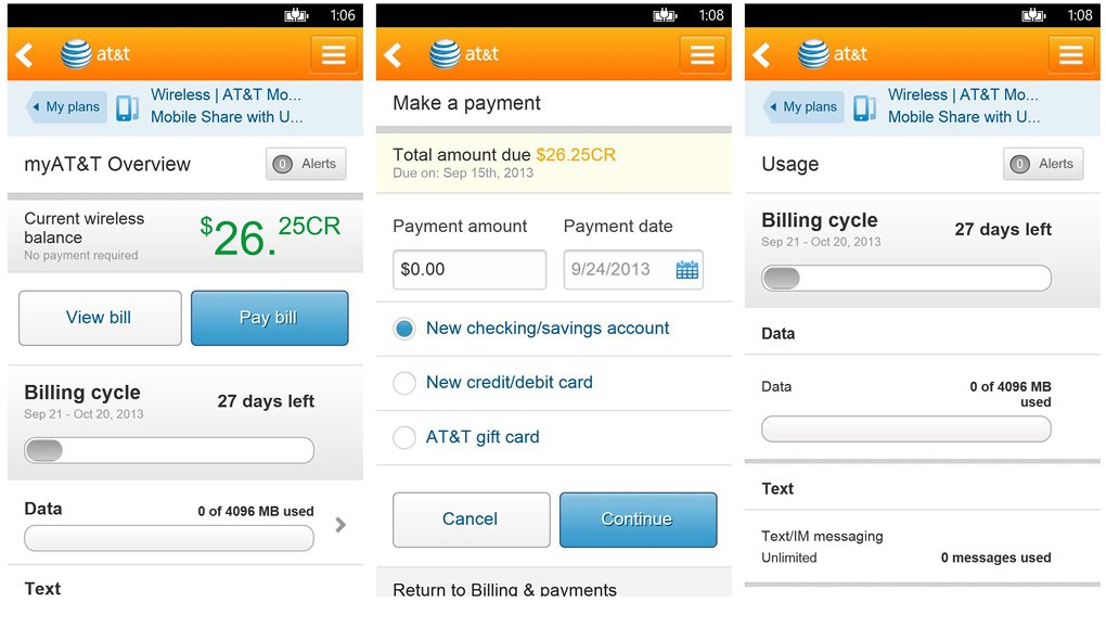
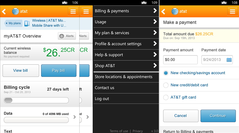
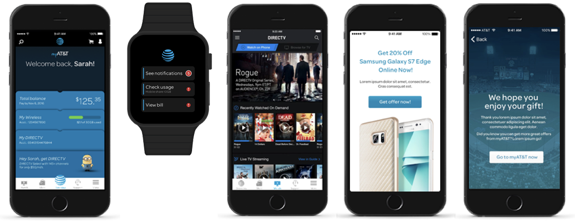
We deliberated on whether the UX should be identical across all platforms, completely independent, or take a different approach altogether. We utilized data from current app analytics to determine the main hubs that should be included in the tab.
We reconsidered the page hierarchy in terms of navigation taxonomy, keeping in mind the users' perspectives and their frustrations with the current navigation. We sought their insights on what improvements could make the experience less frustrating.
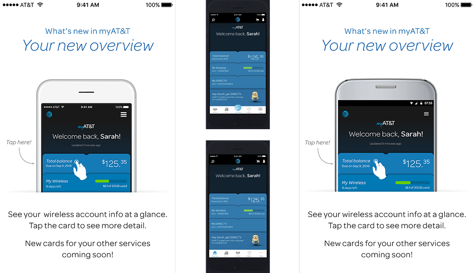
Once we had initial prototypes of the UX variations, we engaged our usability team to gather direct feedback from users. Their input helped us validate our approaches, identify what we got right, what we got wrong, and uncover any aspects we may have overlooked. Armed with this information, we refined our prototypes and conducted further testing to arrive at two viable and effective options to present to our leadership for approval and eventual production.

We had two versions, one was a genuine iOS Tabbed Navigation implementation that followed the structure, practices, and rules of a native iOS application. The other was a simulated Tabbed Navigation that aligned more with the feedback we gathered from users and our current hybrid app implementation.
Unfortunately, due to the typical challenges faced by large organizations, the implementation was scheduled as part of a broader project that was delayed until Q3 2018. Additionally, since persistent navigation had become a standard user experience, we planned to introduce it for Android OS users at a later stage.
We did however achieve a significant milestone in our efforts: developing the watchOS experience. With that completed we were next to evaluate and create an experience for Android Wear. This next phase aimed to extend support to a broader range of wearable devices, bringing the goal of wider platform compatibility firmly within reach.
The addition of this feature accomplishes several key wins: from a customer perspective makes it makes navigation more logical and intuitive while reducing the frustration and confusion with our navigation taxonomy by creating an app that actually feels like...an app.