OrangeTheory

Project Dark Phoenix

Re-imagine the OTF app; identify UX shortcomings, prioritize missing and high-impact features, and implement updates that will elevate the app's overall usability, accessibility, and user satisfaction.

Mobile App UX Redesign Dark Mode Accessibility

ROLE/TEAM

Mobile App Team
Senior UX Designer
UX Researcher
Art Director
UX Writer
IA

TOOLS

Figma/Figjam
Nova
Adobe CC
Adobe Stock
Jira
SharePoint
MS Forms
TestFlight

DATE/DURATION

4 months
Started May 2022 — Aug 2022

Situation

The OrangeTheory mobile app stands as a crucial digital bridge to the member community, yet it currently falls short of delivering a seamless, modern experience. Critical features like dark mode are absent, and several core user flows remain incomplete or unintuitive.

These issues don't just inconvenience users—they risk undermining engagement and weakening the sense of brand loyalty that's central to the OrangeTheory community.

Persistent user pain points, from clunky onboarding to lack of personalization, can quickly turn a powerful digital tool into a source of frustration. Each usability misstep creates barriers that discourage full participation and limit the app's potential to inspire members on their fitness journey.

This project set out with a clear mission: uncover and prioritize the most urgent UX gaps, identify must-have features that drive habit and delight, and implement thoughtful updates with real impact. The ultimate goal is a re-imagined platform—one that supports, motivates, and truly empowers members every step of the way.
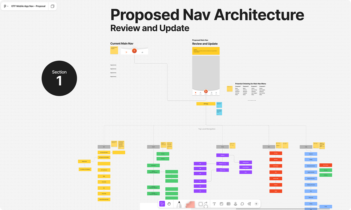
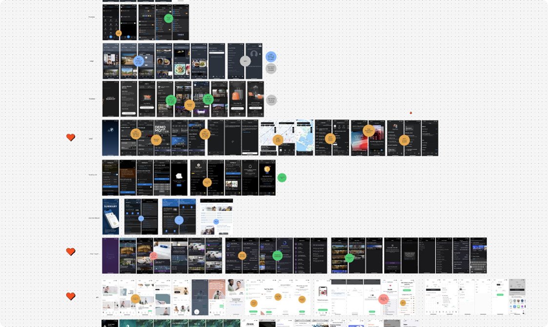
orangetheory app current state showing usability issues missing features dark mode accessibility problems

Goals

  • Conduct a comprehensive review of the OTF mobile app to identify pain points, incomplete UX flows, and feature gaps
  • Prioritize and implement highly requested features—such as dark mode—to enhance accessibility and user satisfaction
  • Improve the app's overall accessibility features to better meet the needs of a diverse member base
  • Streamline navigation and app interactions to ensure a seamless, intuitive experience for all users

Research & Analysis

A survey of 78 leading fitness apps revealed that most offer flexible themes, smoother onboarding, and smarter notification controls—features notably missing from Orangetheory's current app.

In addition, guerrilla user feedback in studios and interviews echoed these findings, consistently pointing to UX frustrations and wish lists for greater customization and accessibility.

This combined research shaped our precise improvement strategy and informed our designs: It told us that Orangetheory needed to modernize its app by closing feature gaps, refining everyday interactions, and elevating both convenience and delight for its members.

orangetheory app current state showing usability issues missing features dark mode accessibility problems

User Personas

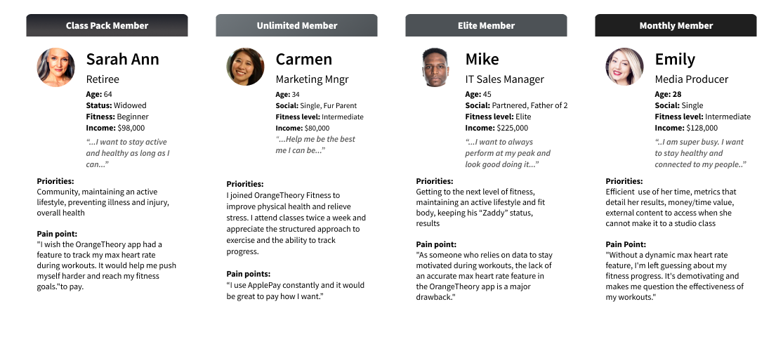
We conducted our activities based on four main personas, which were created by amalgamating the common types found in the Orangetheory Fitness member pool.

orangetheory app current state showing usability issues missing features dark mode accessibility problems

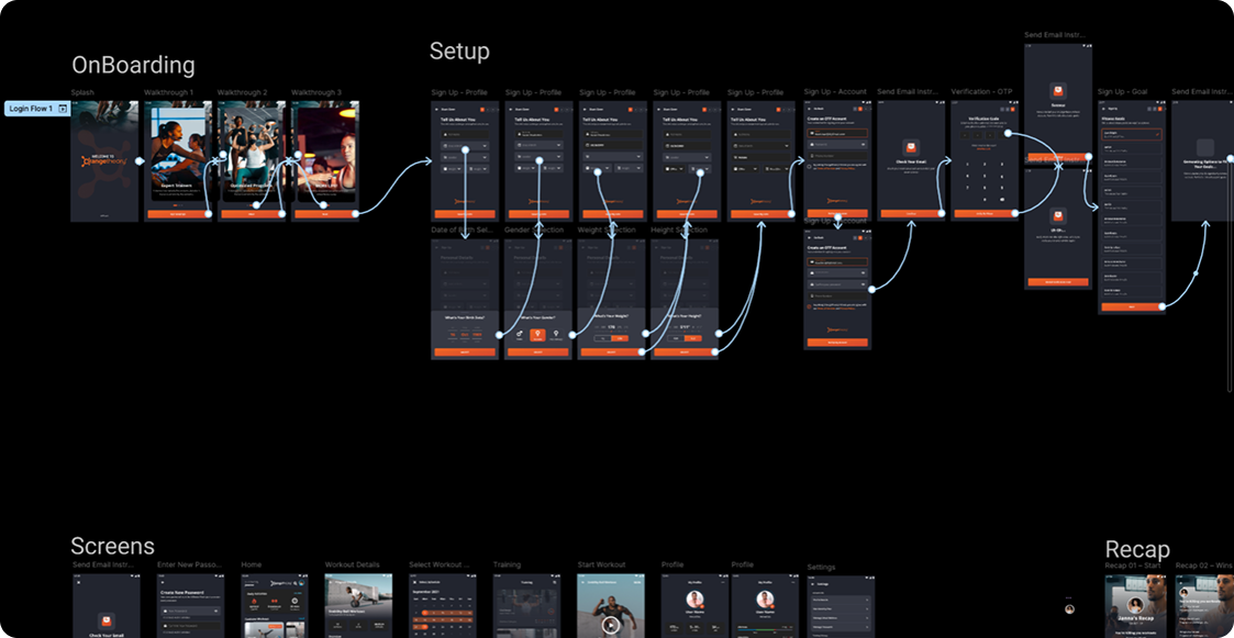
Revamped User Flow: Onboarding

We made onboarding our starting point for transformation—making it the first flow to undergo a complete overhaul. By simplifying every step, eliminating hurdles, and gathering much-needed info up front, we empowered members to get engaged quickly and confidently.

User validation reinforced the impact: we saw faster member activation, more completed sign-ups, and a noticeable drop in studio support needs. Armed with these insights and early wins, we set our sights on elevating every major journey within the app.

orangetheory dark phoenix visual design mobile app interface dark mode accessibility features brand consistency

Concepts, Sketching, Wireframes

Taking information from member/non-member interviews, exploring the current flow, and looking at some examples from the app analysis we did, we identified some key features and presentation elements that we thought would work as solutions for some of the pain points our users told us.

In particular, the Hopper and Amazon apps heavily inspired the direction we took.

orangetheory dark phoenix wireframes concepts sketches app redesign dark mode accessibility features

Visual Design & Prototype

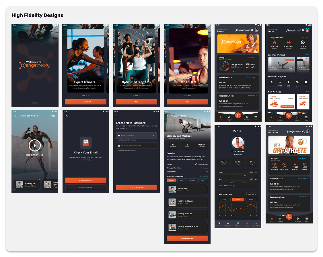
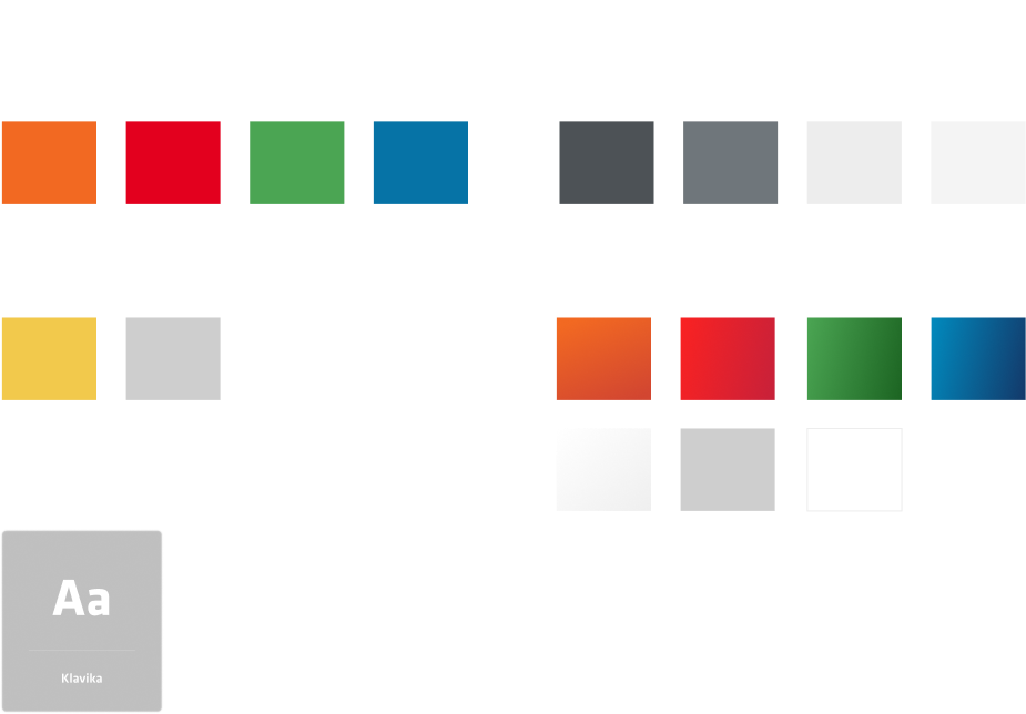
We leveraged the proven frameworks of the OrangeTheory Mobile Style Guide and Design System as our foundation, carefully tailoring them to serve our ambitious goals for the app revamp. Throughout, we made sure to honor the established brand while introducing thoughtful updates—striking a balance between fresh improvements and the signature look and feel OrangeTheory members know and trust.

orangetheory dark phoenix visual design mobile app interface dark mode accessibility features brand consistency

Test: Validation, Usability, Feedback

Gaining access to users for research and feedback was an ongoing challenge due to the tangled web of studio agreements and franchisee control over user data. Official pathways for user contact were often blocked by contractual restrictions and compounded by lingering friction with corporate strategic priorities. These hurdles made traditional research methods nearly impossible.

To push forward, I embraced grassroots solutions: connecting with users informally and leveraging personal networks to recruit participants for feedback sessions, like member-led Reddit, Instagram, and Facebook groups. These sessions went far beyond merely collecting opinions—they became the backbone of our concept validation process.

As there were no centralized pools of user data or reliable recruitment channels, every piece of user-driven insight was precious. We tested early concepts, refined prototypes, and validated design decisions in small, agile cycles based entirely on user interaction attained through these unofficial avenues.

This scrappy approach not only filled vital knowledge gaps, but also ensured that our solutions were grounded in real, unfiltered user needs—even when formal research infrastructure and support were out of reach.

Challenges & Conclusion

There were some setbacks:

1. Organizational Restructuring

Changes in company structure led to priority shifts and unclear project ownership, delaying work on the project.

2. Team Layoffs

Losing critical team members, especially in UX, led to a loss of expertise and knowledge gaps, making it harder to resume or sustain progress.

3. Odd Studio/Partnership Agreements

Because of how the studio partnership agreements are structured, getting access to users was very difficult, requiring the product team to think of novel methods to involve real humans in our design and research efforts.

4. Leadership Turnover

Following end-of-year leadership changes, a wave of layoffs and organizational restructuring abruptly halted the project. The departure of the entire UX team effectively ended all project work at OTF.