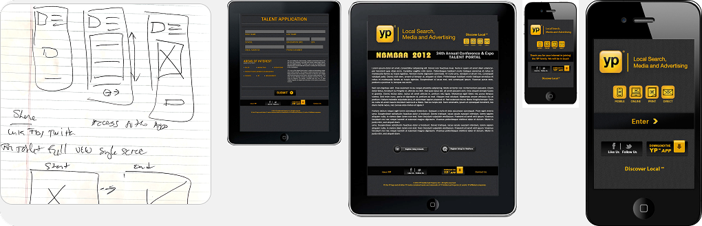
An HTML5-based mobile recruitment app for the 2013 NBMBAA event for AT&T interactive/YP.com
AT&T needed to create a mobile app within four weeks to serve as an engagement vehicle for the 2013 NAABMBA event. The app was to be a recruiting tool and had to be designed with UX/UI in mind.
The project was a special request from YP (formerly AT&T Advertising Solutions/AT&Ti) with a very tight timeline for the entire project scope of work.
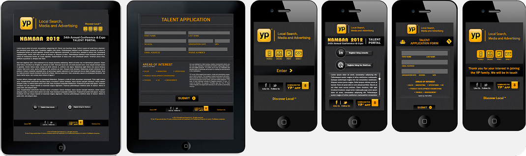
My goal was to devise a portable and device-agnostic app that would ensure seamless interaction for respondents. Given the highly limited runway we had to complete the project, I created basic designs incorporating YP.com brand elements and used other event apps and webforms as reference.
Recognizing the need for ease-of-use in a bustling and distracting environment, I introduced the option of extracting information from a published LinkedIn profile. Although this functionality was relatively novel and uncommon at the time, it provided a straightforward means of gathering ample candidate data with minimal exertion.
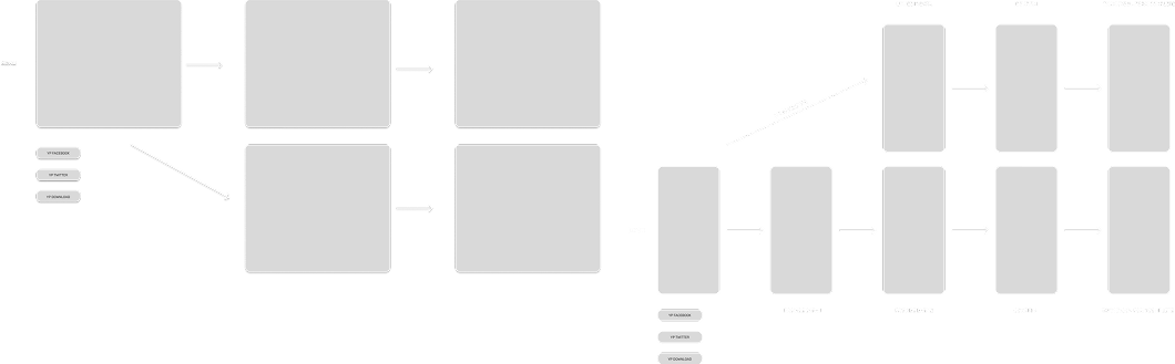
Lastly, I adopted an adaptable approach, allowing for potential optimization of app content across screens and devices in the future.
The flow starts with the launch screen, and from there, users are directed to the home screen card that displays both old and new values and links to the feature educational content, including videos, text, and external articles available via branches from the home screen.
The main feature can be accessed via two paths: integrated into the performance summary or as a stand-alone capability. In addition to these core features, we have introduced some additional capabilities, such as launch screens and video educational content.
As we wanted to minimize development overhead while creating a simple, easy-to-follow registration flow so I designed the low around shared components and followed adaptive design concepts to ensure that users would be presented with a consistent experience that guided them to completion as we mapped out flows for both mobile and tablet/desktop devices.
Because this would not be an app that would have time to go through the normal review by the brand team, I developed a style guide for a that aligned with the established YP Design System guidelines. This way, when it was launched, it would look the part and be able to pass review when submitted for subsequent years.
We created a hybrid adaptive app that works on both tablets and mobile phones for the event. The app was designed to be easy to use and helped YP recruit people who were interested in internship, mentorship, and employee recruitment programs.
This pattern was then also used to create targeted recruitment apps for other events.
There were some setbacks:
1. The delivery timeline was considerably condensed. With more time to explore the architecture and design I might have made different choices.
2. Extremely limited testing and feedback before going to production. While there were no usability problems as we were not able to do more in depth user testing of the prototype or final release version. Luckily, there were no reported issues with the app.
We were able to meet the request shortened launch timeframe, and despite some trepidation around more testing, the app was well received and was a great first mobile app for me as a UX/UI and Product Designer.